Devhub, a reputable provider of custom website and mobile app solutions, is venturing into the online payment industry with the introduction of their new product, HubHub. As a contracted UX designer, I have been entrusted with the task of designing the website for HubHub. Drawing on their extensive experience in online payment implementation, Devhub aims to offer a robust and user-friendly online payment solution to their clients.
In this project, my role as a UX designer is pivotal in shaping the user experience and visual design of the HubHub website. Initially assigned to create a logo and website, I recognized the value of a consistent visual identity and successfully pitched this idea to Devhub. As a result, my responsibilities expanded beyond the initial scope, encompassing the creation of a comprehensive set of assets, including the logo, icons, illustrations, and UI elements.
After conducting interviews and engaging in discussions with the client, I identified several keywords that encapsulate the essence of the HubHub product: safe, modular, and integration. These keywords serve as the guiding principles for the visual direction and design approach.
Taking inspiration from the company's logo, geometric shapes were proposed to represent a solid and modular impression in the visual identity. These shapes symbolize reliability and adaptability, reflecting HubHub's capabilities while allowing for seamless integration across platforms and systems. This approach ensures a visually cohesive brand presence that embodies the core values of HubHub.
I prioritized the logo design as a crucial element in establishing the brand image for HubHub. Building upon the logo's style and story, I expanded the visual identity to include a cohesive set of icons and illustrations. This comprehensive visual system ensures consistency and reinforces the brand's messaging. By aligning these elements, the visual identity of HubHub becomes a memorable representation of its unique value proposition in the online payment market.
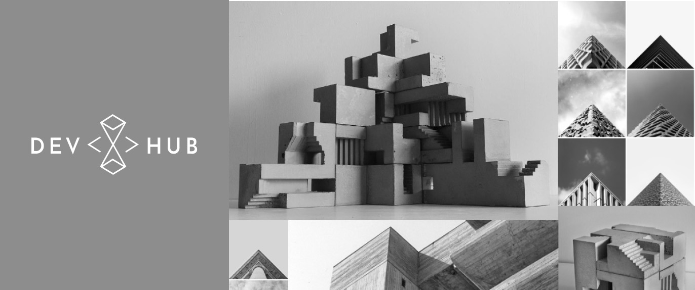
Drawing inspiration from architectural styles, I explored various concepts and presented them to the customer. Together, we selected the following concept as our starting point.
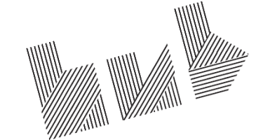
The chosen concept adopts a geometric style, using shapes that evoke a sense of solidity, assurance, and modernity. The materiality of the logo takes inspiration from concrete, further reinforcing the impression of strength and stability. The layout of the logo is designed to represent building blocks, reflecting a geometric and modular structure.
This logo design aligns with the desired brand image for HubHub, conveying a sense of reliability, innovation, and adaptability. It serves as the foundation for the visual identity, setting the tone for the overall brand and ensuring a consistent and impactful representation across various touchpoints.

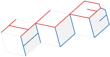

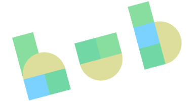
Building upon the style and impression of the logo, I created a cohesive set of icons that align with its visual aesthetic. These icons maintain consistency in terms of style, shape, and overall impression.
Following the geometric and solid design language inspired by the logo, the icons are designed to be visually cohesive and easily recognizable. By using consistent shapes, lines, and proportions, the icons complement the logo and reinforce the brand identity of HubHub.These icons serve as visual representations of various features, functionalities, and actions within the HubHub product. They contribute to a unified and intuitive user experience, facilitating easy navigation and understanding of the product's offerings.
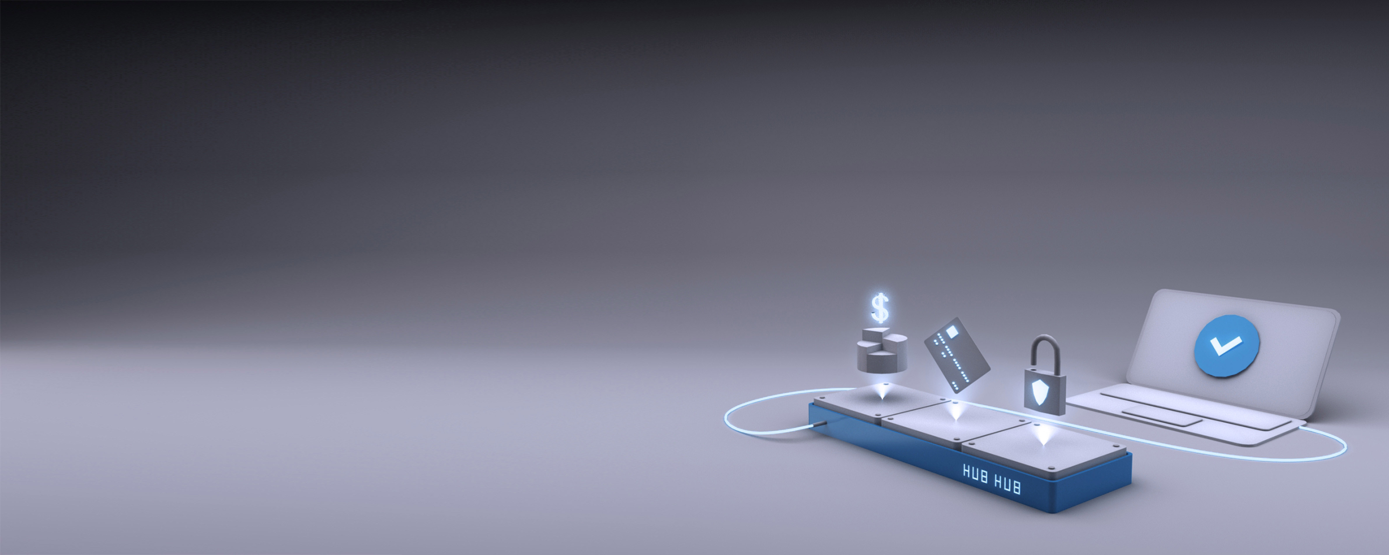
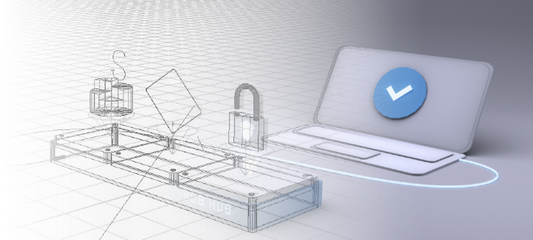
To further enhance the visual identity and storytelling of HubHub, I created a series of 3D rendered illustrations inspired by architecture and aligned with the brand's identity. Using Autodesk Maya, I meticulously modeled and rendered these illustrations to convey the concepts of safety and compatibility.
The illustrations showcase the seamless integration and compatibility of HubHub's online payment solution with various platforms and systems. They visually communicate the product's value proposition, highlighting its reliability and ability to adapt to different environments.
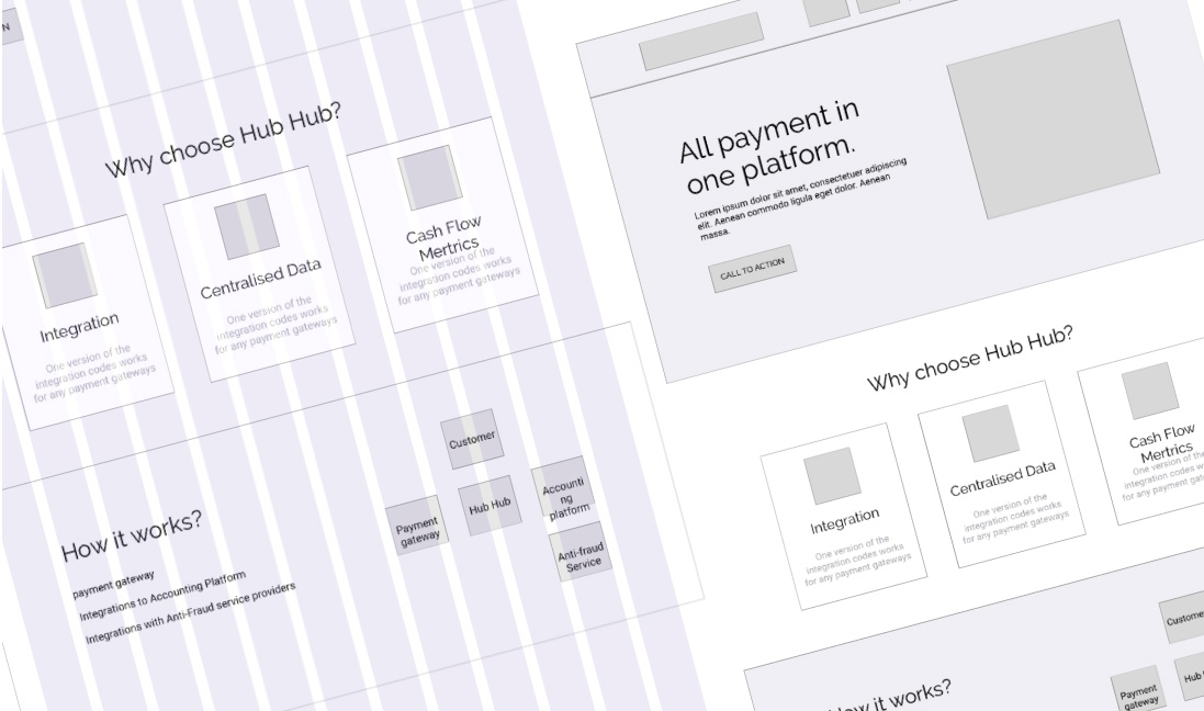
Prioritizing customer collaboration, I engaged with them to understand the website's content and designed a 12-grid responsive wireframe. This preliminary representation ensured the customer's satisfaction with the information layout and facilitated a smooth transition to the high-fidelity design phase. By involving the customer early on, we created a user-friendly structure and minimized the need for extensive revisions.
