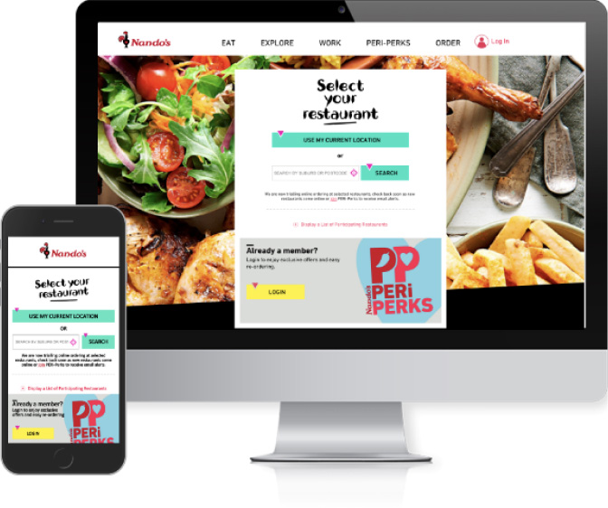
OrderUP is a food commerce platform that offers customized online ordering systems for businesses, ranging from small local restaurants to large franchises. Following its initial launch and successful establishment of a customer base across Australia, feedback from users highlighted the need for a product redesign. I led a three-month project focused on improving core workflows, ensuring an intuitive user experience aligned with the business model. As part of this project, I delivered a visual design system, wireframes, customized icons, a set of high-fidelity mockups, and a functional prototype. The outcome received high praise from notable customers such as Nandos and KFC.
In my role, I took charge of the redesign project, assuming responsibility for enhancing core workflows and creating an intuitive user experience tailored to the business model. I crafted a design system that allowed customers to customize the product, developed prototypes in both low and high fidelity to effectively communicate the user experience to stakeholders and developers.
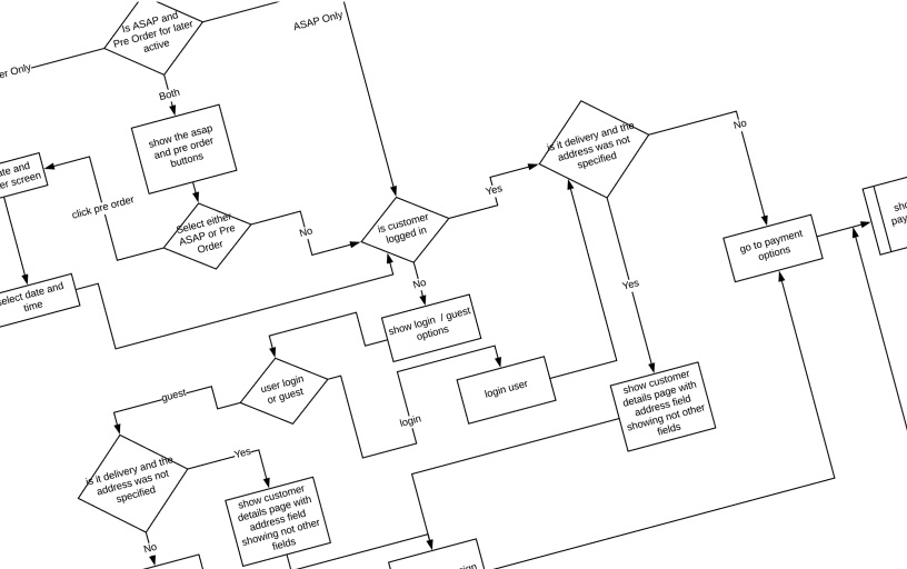
Working closely with the project manager and stakeholders, I formulated core user journeys based on customer feedback, heuristic evaluations, and interviews. These journeys served as the basis for creating journey maps that articulated the specific scenarios that needed to be designed, such as ordering, checkout, and payment processes.
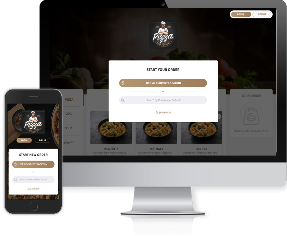
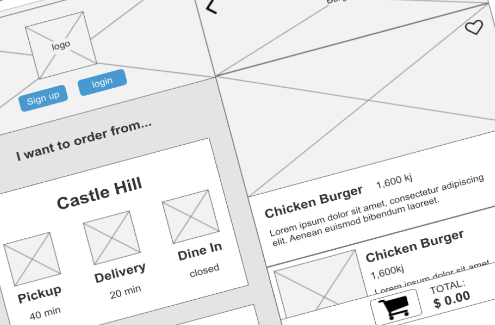
Using low-fidelity wireframes, I collaborated with the project manager and design manager to discuss and refine the design approach. These wireframes were crucial in communicating the design concepts to stakeholders and validating them with customers. I adopted a mobile-first design approach, deviating from the previous product's methodology.
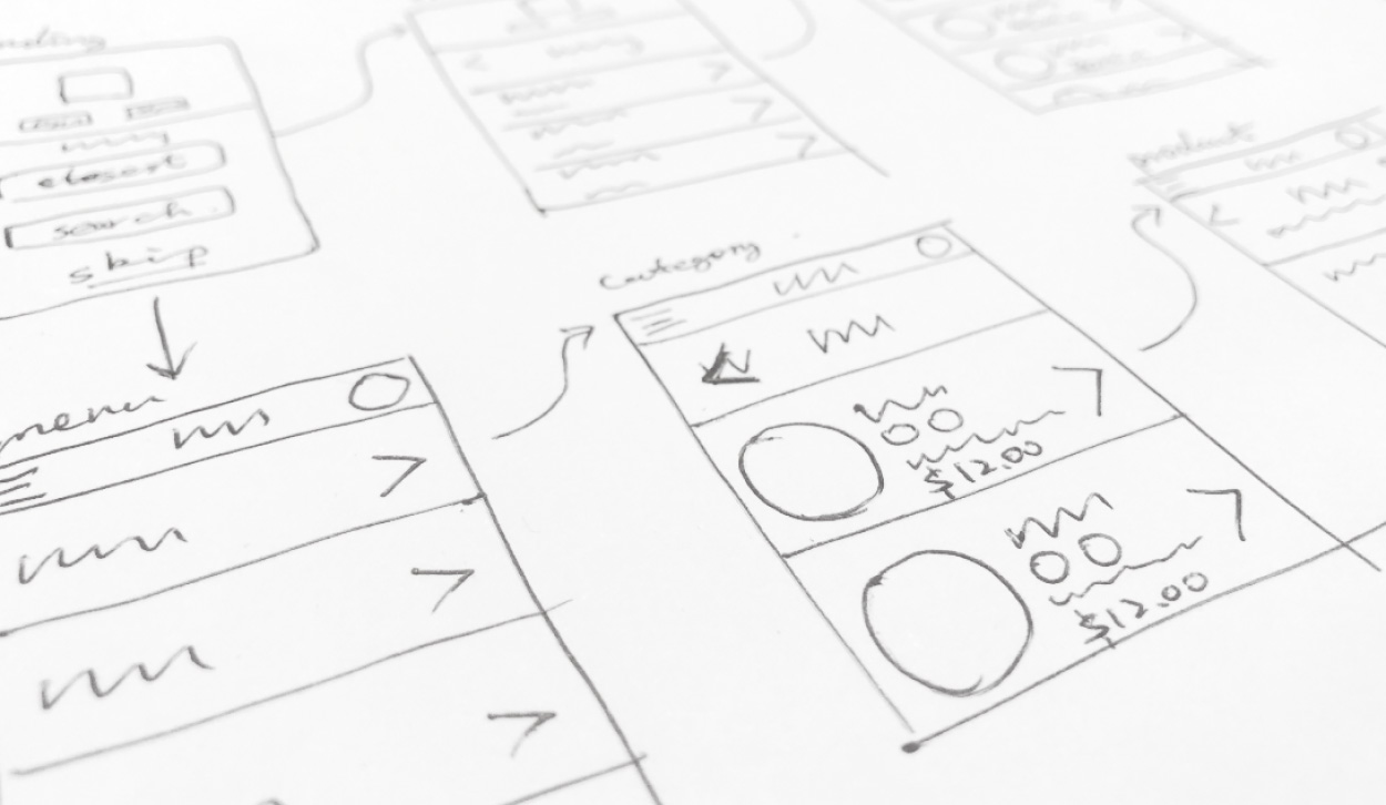
Based on the sketches, I developed a low-fidelity prototype using Axure. This allowed us to assess if the design met the requirements and enabled the design of interactions to ensure the core user journeys were simple and intuitive. After conducting internal and external testing on the prototype, we reached a favorable position to proceed with high-fidelity design.
Check out the prototype.
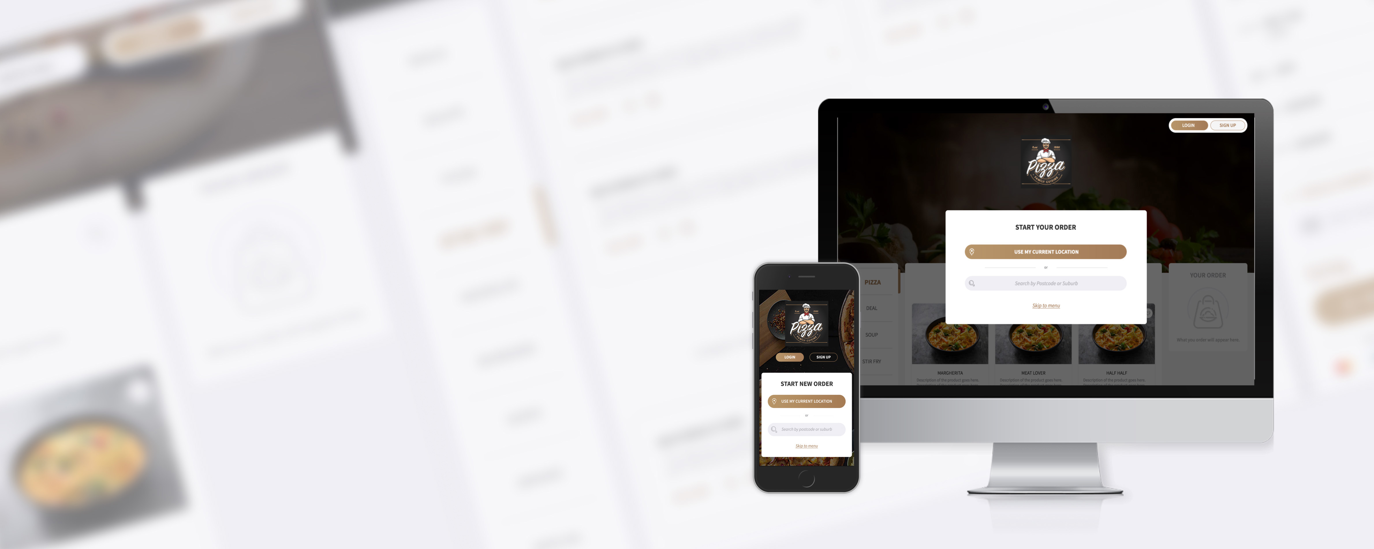
The UI design employed a responsive grid system, accommodating mobile, tablet, and desktop devices. I planned designs for various breakpoints, including mobile, horizontal and vertical tablets, regular desktop, and large desktop.
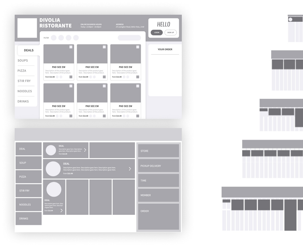
Given that this project involved designing a design system and template for customers to visualize the possibilities and build their own web apps, the framework of design held equal importance to the interface. To facilitate ease of implementation by developers, I created a set of customized icons as glyph fonts.
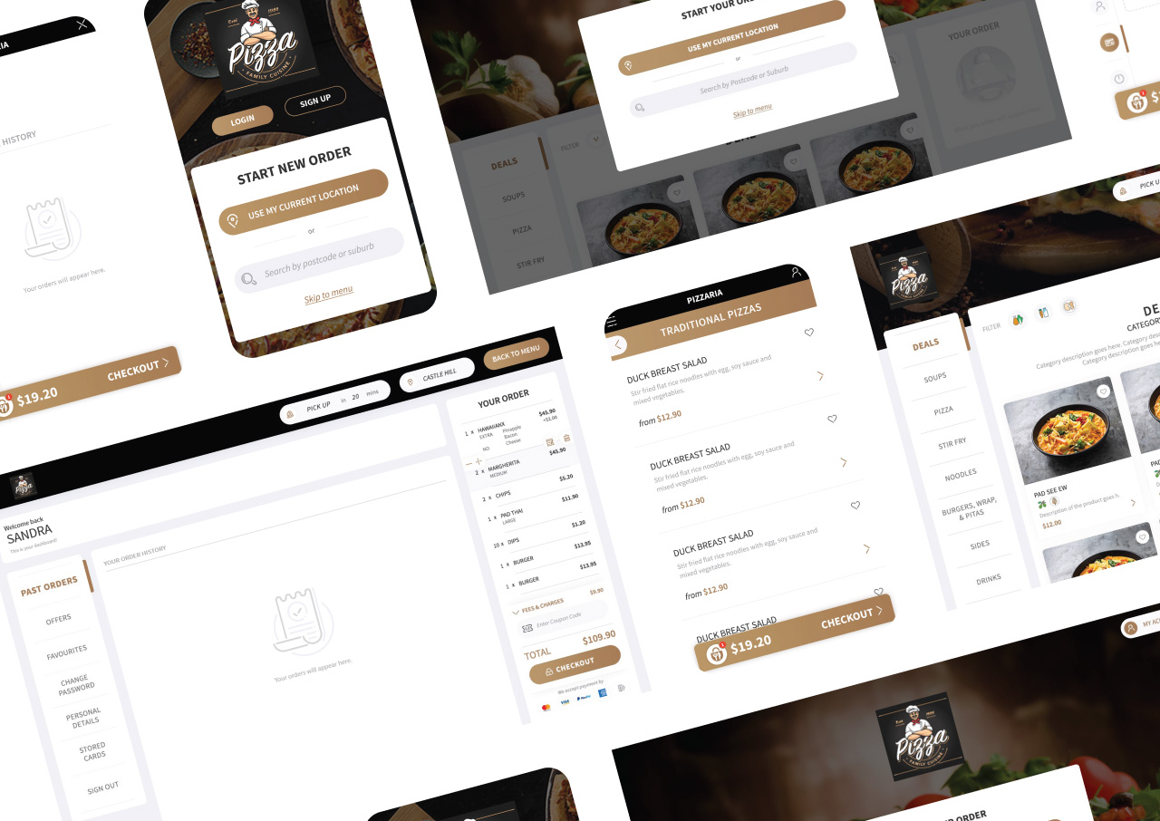
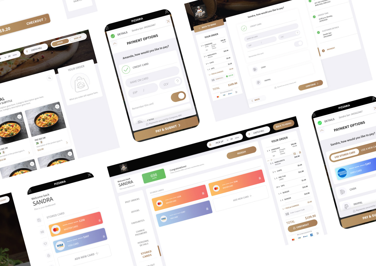
Recognizing the challenges posed by communication with the remote development team, I took the initiative to create a high-fidelity prototype with intricate details of animations and interactions using Axure. The goal was to provide a realistic representation of the product and minimize the risks of miscommunication. Please feel free to explore the desktop prototype and the moible prototype. to experience the interactive functionalities firsthand.